The Challenge
Mystic Seaport, the Museum of America and the Sea, opened a new exhibition hall in 2016, an exciting new chapter in the Museum’s transition from quaint New England history locale to a national platform for public dialog about maritime history and the issues facing the ocean today. They asked us to guide them to a contemporary brand expression to match this new organizational strategy.
My role as strategy lead on this project entailed shepherding our client and internal teams through the multiphase strategy portion of the project.
The Tasks
Brand Platform
Stemming from Grace Paik’s comprehensive brand and experience audit, Jennifer Passas and I developed and lead an insights and platform workshop with Mystic Seaport Museum’s leadership team. In this workshop we reviewed research, insights, peer and competitive sets, naming and campaign concepts. The output of this workshop was a collaboratively generated brand platform on which our brand identity, campaign and web work would be built.
Naming Research
In the 1990s the museum changed its public name from Mystic Seaport Museum to Mystic Seaport, the Museum of America and the Sea. The Museum was interested in reverting to its former, and still legal name, to expand its mission globally. We offered a thorough exploration of the contemporary naming landscape and the strategic and design implications of the name change in an audit of museum naming trends and conventions as well as strategic justifications for simplifying the name. This audit was presented to the board for approval.
Brand Campaign
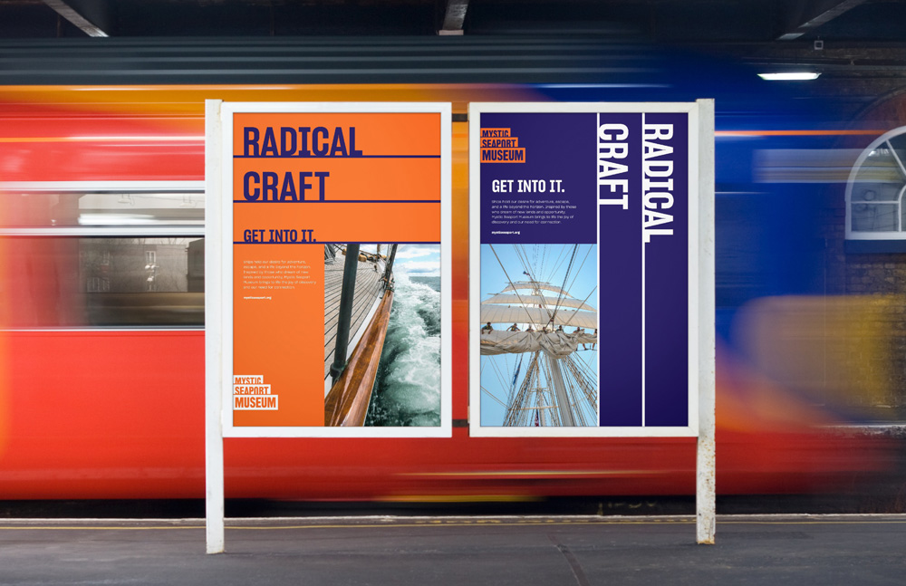
In preparing to launch the new brand the museum wanted brand level campaign messaging to introduce the museum’s new positioning. We created a tagline and campaign position to celebrate the radical nature of seafaring and exportation throughout history.
Identity
Building on the strategic platform and extensive site and visual research Daniel Irizarry lead the design on Mystic Seaport Museum’s new identity. (see Under Consideration)

Website
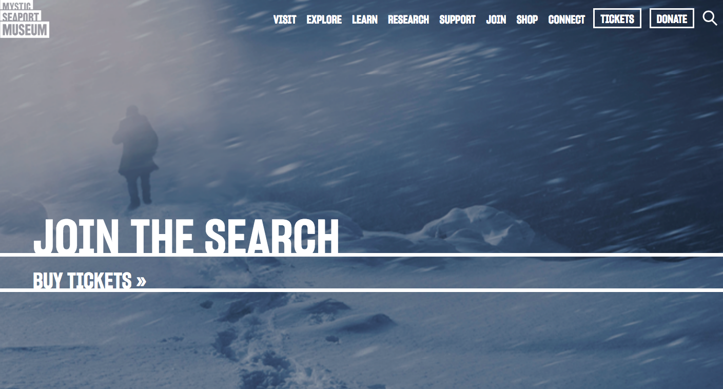
Museum websites are notoriously complex. Often built in layers to serve visitor, research and education needs as funds are available, visuals and technology can become a quagmire. To streamline the digital experience we prioritized visitor experience on the top three pages of the site: Home, Visit and Explore. In addition, I created content for these pages.
Launch
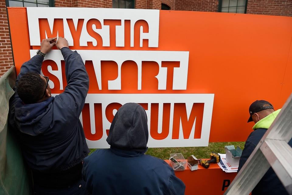
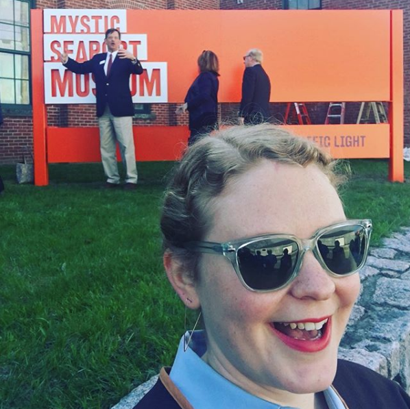
With the Museum leadership, CSA coordinated three stages of this launch and rollout. For a museum of the size and history of Mystic Seaport Museum, it was vital to include the museum community in the rollout. We created and lead presentations for the staff and volunteers, hosting Q & A sessions to address concerns and future plans for the brand. After the brand was introduced internally there was a public launch, hosted by museum leadership, to unveil new signage to the local press, such as The Day. From here the press was engaged to present the new brand and organizational strategy to the community and beyond.
Response
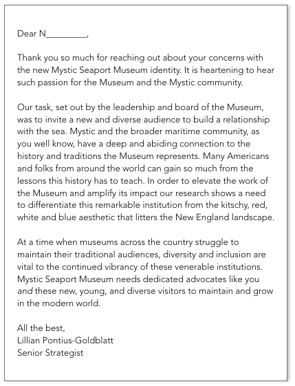
Mystic Seaport Museum is an integral part of the Mystic, CT community and the identity made waves across the region. After many years (nearly 20) with a very traditional red, white and blue logo the bold, modern, orange took some serious flack in the local community. A part of our role was helping the leadership of the organization stay strong in this storm.
I got my first hate mail here, a series of letters from a very engaged community member who was disappointed to see the Museum leave behind the red, white and blue. Following is my response to the second of these letters we received. I include this in hopes that it demonstrates my sincere desire to connect with and understand the audiences I am speaking to, and also my conviction in the research, strategy and collaboration with our client that lead us to this new identity.
